This project focused on creating a cohesive brand guideline for Canoe Coffee Roasters, a family-run specialty coffee company in Kelowna, British Columbia. The aim was to capture the company’s adventurous, community-oriented spirit while ensuring clear, professional rules for visual consistency across print, digital, and packaging.
The main challenge was to reimagine a coffee brand that balanced heritage and modernity while preserving its connection to Canadian nature. The guidelines needed to cover logo usage, typefaces, colour palettes, and applications, while ensuring flexibility for digital and print environments
Research: Studied competing specialty coffee brands and Canadian heritage motifs. Analyzed how earthy tones and natural symbolism could translate across stationery, signage, and online platforms.
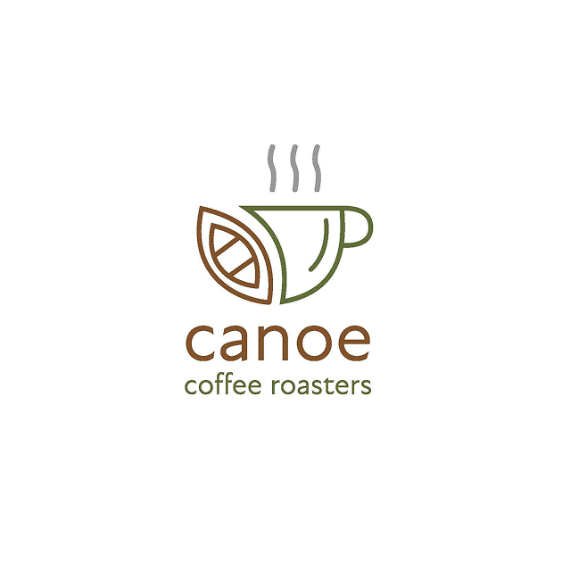
Ideation: Explored the canoe–coffee cup hybrid as the central symbol. Researched the coffee brand and the vibe they’re trying to give. Sketched 20 different concepts, chose one and sketched 20 more of that option.
The final deliverable was a comprehensive brand guideline document outlining Canoe Coffee Roasters’ identity system. The canoe-coffee cup mark embodies both Canadian adventure and the comfort of a warm drink, while the natural color palette ties the brand back to its roots. Applications on stationery, packaging, and online presence were included to demonstrate consistency.